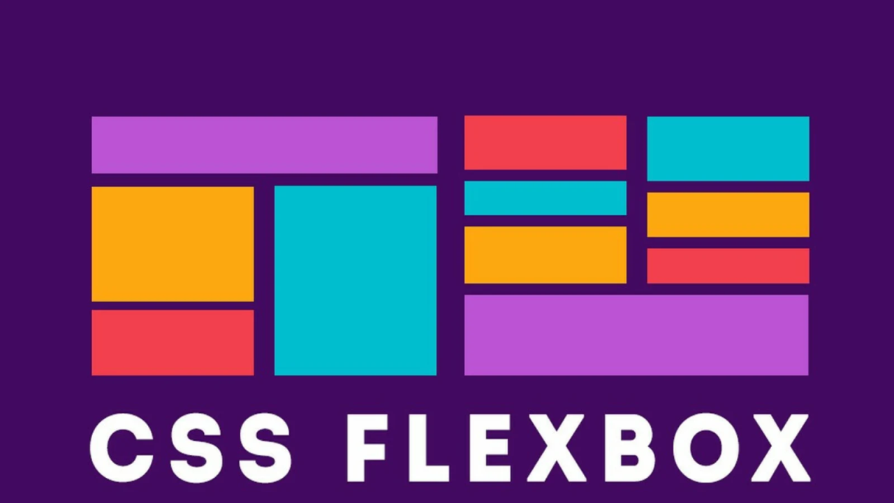
CSS Flexbox (Part-1)
"In web design, CSS Flexbox is like a superpower for making websites look good on any screen. We'll explore it together with easy examples. It makes designing websites cool and effortless. Let's begin! ?"
Understanding the Basics
Before we delve into the properties, let's understand the fundamental concepts of Flexbox:
The Flex Container Properties
1. display
.container {
  display: flex;
}
2. flex-direction
.container {
  flex-direction: row; /* Default value */
}
3. justify-content
.container {
  justify-content: center;
}
4. align-items
.container {
  align-items: center;
}
5. flex-wrap
.container {
  flex-wrap: wrap;
}
领英推荐
6. align-content
.container {
  align-content: space-between;
}
The Flex Item Properties
7. flex-grow
.item {
  flex-grow: 1;
}
8. flex-shrink
.item {
  flex-shrink: 0;
}
9. flex-basis
.item {
  flex-basis: 50%;
}
10. flex (Shorthand)
.item {
  flex: 1 0 auto; /* flex-grow, flex-shrink, flex-basis */
}
11. order
.item {
  order: 2;
}
Conclusion
CSS Flexbox is your ticket to creating awesome, adaptable web layouts. ??? Master these properties, and you'll be designing with finesse in no time. Let your creativity soar! ??
#WebDesign #CSSFlexbox #ResponsiveWeb #DesignSkills