Viz 101 - Column Charts vs. Bar Charts
My Visualizations (Viz) 101 series is intended for people who want to work in analytics or are just starting out. I will provide you with a description of many different types of visualizations, what they are best used for, and a technical guide on how to create them in Excel (because pretty much everyone uses Excel and has a copy available) and Tableau (because it's an amazing BI tool and Tableau Public is free).
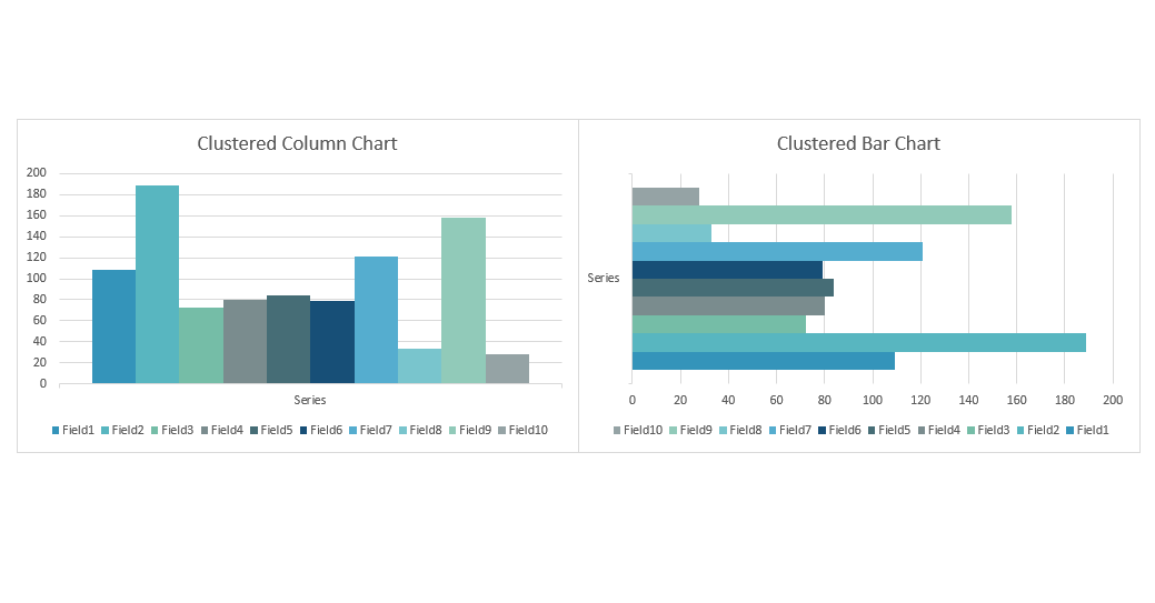
I wrote a previous article focused solely on column charts and I wanted to use another short article to talk about the difference between column charts and bar charts. Here it goes. column charts are oriented vertically and bar charts are oriented horizontally. OK, great, end article.
Not really, I have more to say. There is not much of a difference in how you make or would use these, in general. It mostly comes down to preference. If you are constructing a dashboard to display many graphs together, you may find that one orientation works better than the other.
So how can I change between them? In Excel, if you already have a column or bar graph made, then simply click on the graph, navigate to the Chart Design tab on the ribbon, click on the Change Chart Type, find Column or Bar, and select the graph you want to change to.
领英推荐
In Tableau, this is handled by literally the click of a button. The Swap Rows and Columns button (or the hotkey CTL + W).
Here are some things to keep in mind when deciding between a bar chart or a column chart.
I hope you found this helpful and if you did please consider liking or sharing the article. Stay tuned for future articles in this series.