Understanding Scatter Plots: A Comprehensive Guide
Prof.Dr.Gopal Sivakumar
Head, Campus to Corporate Program @ Vision Excellence | MSME - TDC | Lean Six Sigma Master Black Belt | Author | Trainer | Business Coach | Lean Consulting | Six Sigma Consulting| 5S | OpEx Consulting
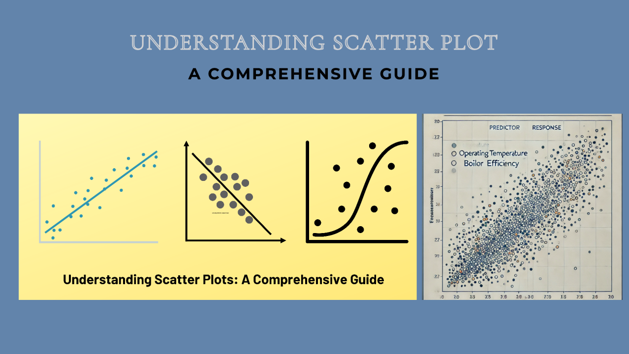
A scatter plot, or scattergram, is a graphical tool used to show the relationship between two numerical variables, making it a staple in data analysis. Each point represents an observation, with its position based on two variables: the X variable (Predictor) and the Y variable (Response). The predictor is plotted on the x-axis, while the response variable is on the y-axis, enabling analysts to explore correlations and trends.
Key Components of a Scatter Plot
Interpreting Relationships in Scatter Plots
Practical Applications of Scatter Plots
领英推荐
Role in Regression Analysis
Interpreting scatter plots is key in choosing the correct mathematical model for regression analysis. By observing the pattern of data points, analysts can decide if a linear or non-linear regression model would best capture the relationship, making scatter plots valuable for developing accurate predictive models.
Limitations of Scatter Plots
Conclusion
Scatter plots are powerful yet simple tools for visualizing relationships, providing foundational insights into correlation and guiding model selection in regression analysis. While they have limitations, scatter plots remain invaluable for examining measurable variables across fields, from manufacturing and automotive to health and data science. Whether you’re exploring initial trends or building a model, scatter plots offer a clear first look at how two variables interact.