Understanding the CSS Box Model
Mounika Palavalasa
Full Stack Developer at Amaravathi Software Innovations Pvt Ltd
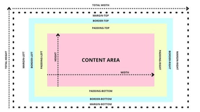
The CSS Box Model is one of the most fundamental concepts in web development. It defines how elements are structured and spaced on a webpage. Each HTML element is considered a box, which consists of several components: content, padding, border, and margin. This model is crucial for layout design, controlling element sizes, spacing, and the overall look of a webpage.
1. Height and Width
The height and width properties define the size of an element's content box. By default, an element's height and width apply only to the content area. The box model, however, involves more than just the content area.The box model, however, involves more than just the content area. When you set the width and height of an element, the padding, border, and margin add additional space around it, unless specified otherwise.
2. Borders
Borders are a part of the box model and are placed around the content and padding of an element. The border has its own width, style, and color, which can be customized to create different effects around the element's content.
box {
border: 2px solid black;
}
In the above example, the border is 2px wide, solid, and black.
3. Border Radius
The border-radius property allows you to create rounded corners for elements. This property can be applied to the content box or an element with a border.
box {
border: 2px solid black;
border-radius: 10px;
}
Here, the element will have rounded corners with a 10px radius, giving it a softer appearance.
4. Padding
Padding is the space between the content and the border. Padding increases the area inside the element but doesn't affect the element's width and height directly unless you are using the box-sizing property.
box {
padding: 20px;
}
This example adds 20px of space inside the element between the content and the border on all sides.
5. Padding Shorthand
You can specify padding for all four sides in one line using shorthand:
box {
padding: 10px 20px 30px 40px;
}
This shorthand works as follows:
10px for the top
20px for the right
30px for the bottom
40px for the left
If only two values are provided, the first value is for the top and bottom, while the second is for the left and right.
6. Margin
Margins are the outermost space of the box and create space between the element and surrounding elements. Unlike padding, margin does not affect the size of the element itself.
box {
margin: 20px;
}
This adds a 20px space around the element, separating it from its surrounding elements.
7. Margin Shorthand
Just like padding, margins can also be set using shorthand:
box {
margin: 10px 20px 30px 40px;
}
This shorthand syntax behaves the same as the padding shorthand:
10px for the top
20px for the right
30px for the bottom
40px for the left
If only two values are given, they apply to the top and bottom, and left and right.
8. Auto
The auto keyword is commonly used with margin, particularly for centering elements. When you set the left and right margins to auto, the browser calculates the remaining space and centers the element horizontally.
box {
width: 50%;
margin: 0 auto;
}
Here, the element with 50% width will be centered within its parent container.
领英推荐
9. Margin Collapse
Margin collapse happens when vertical margins of adjacent blocks combine into a single margin. This occurs when two margins meet, and the larger margin takes precedence. It’s important to note that this only happens with vertical margins (top and bottom).
For example, if one element has a 20px margin at the bottom and the next element has a 30px margin at the top, the total space between them will be 30px, not 50px.
10. Minimum and Maximum Height and Width
CSS provides the min-height, max-height, min-width, and max-width properties, allowing you to set constraints on the dimensions of an element. These ensure that the element does not shrink or grow beyond the specified limits.
box {
min-width: 200px;
max-width: 500px;
}
This ensures that the element's width stays between 200px and 500px, regardless of content or screen size.
11. Overflow
The overflow property controls what happens if content overflows an element's box. The common values are:
visible: Content will overflow the box.
hidden: Overflowing content will be clipped, and the rest will be hidden.
scroll: Scrollbars will appear if content overflows.
auto: Scrollbars will appear only if necessary.
box {
 overflow: auto;
}
This will add scrollbars if the content exceeds the container's dimensions.
12. Resetting Defaults
Many browsers have default styles applied to elements. To achieve more consistent layouts across browsers, developers often use a CSS reset. This helps remove or neutralize default styling (like margins, paddings, and borders) so that custom styles are applied uniformly across different browsers.
* {
margin: 0;
padding: 0;
box-sizing: border-box;
}
This example resets margin and padding to zero for all elements and sets the box model to border-box.
13. Visibility
The visibility property controls whether an element is visible or hidden. Unlike display, which removes the element from the document flow, visibility only hides the element but still occupies space in the layout.
box {
visibility: hidden;
}
In this case, the element will not be visible, but it will still take up space on the page.
14. Why Changing the Box Model
By default, the box model uses the content-box value for the box-sizing property, meaning the width and height you set only apply to the content area. The padding and border are added outside this box, affecting the final size.
However, in many layouts, it's more intuitive to include padding and borders in the element's overall dimensions. That's where box-sizing: border-box comes into play. This changes the box model to include padding and borders within the specified width and height.
box {
box-sizing: border-box;
}
When box-sizing: border-box is applied, the padding and border are included in the element’s width and height, making it easier to control the element's size without needing to account for extra padding or border space.
15. Content-Box
content-box is the default value for the box-sizing property. It means that the width and height set on an element apply only to the content area. Padding and borders are added outside of this area, which can sometimes lead to layout inconsistencies.
box {
  box-sizing: content-box;
}
16. Border-Box
border-box includes the padding and border within the element’s width and height. This makes it easier to manage the element’s size, especially when using padding or borders, as it prevents the overall dimensions from increasing unintentionally.
box {
box-sizing: border-box;
}
17. New Box Model
The "new" box model is based on box-sizing: border-box. It is considered more intuitive because it includes padding and borders in the total width and height, allowing developers to control layouts more effectively without worrying about unexpected sizing issues. Modern web design often uses this box model for consistent, predictable layouts.
Conclusion
Understanding the CSS Box Model is essential for any web developer. The box model defines the structure of an element and helps manage the dimensions, padding, borders, margins, and overflow behavior. By utilizing properties like box-sizing, min-width, max-width, and margin, you can create more flexible and predictable layouts.
??That’s all for today’s learning! Thanks for joining me on this part of our exploration. I’m excited to continue next week. In the meantime, keep up the great work and stay enthusiastic about learning. See you soon! Happy learning ! ??