Transforming Raw Data: Mastering Excel Visualization
Introduction:
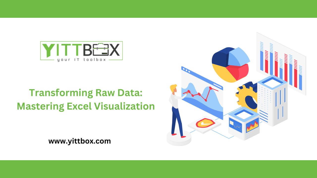
In today's data-driven world, transforming raw data into insightful visualizations is essential for effective decision-making. Microsoft Excel, a ubiquitous tool in data analysis, offers a plethora of features to help users create compelling charts and graphs. This blog delves into how Excel can convert raw data into meaningful visual representations, enhancing data comprehension and storytelling.
Understanding Data Visualization: Simplifying Complex Data
Data visualization involves presenting data in graphical formats such as charts, graphs, and maps, making complex datasets more accessible and understandable. Excel provides various chart types—bar charts, line graphs, scatter plots, pie charts, and heat maps—each serving specific purposes. For instance, bar charts are ideal for comparing categories, while line graphs effectively depict trends over time.
Excel's Charting Capabilities: A Versatile Toolkit
Excel's robust charting tools cater to diverse data visualization needs. Users can create:
These visualizations aid in identifying patterns, trends, and outliers within datasets.
Best Practices for Effective Data Visualization in Excel:
To create impactful visualizations, consider the following best practices:
These guidelines ensure that your visualizations effectively communicate the intended message.
Advanced Excel Features: Enhancing Visualization Capabilities
Excel's advanced features further augment data visualization:
These tools empower users to perform in-depth data analysis and present findings compellingly.
Staying Current: Data Visualization Trends
As data visualization evolves, several trends are shaping the landscape:
Staying abreast of these trends ensures that your visualizations remain relevant and impactful.
Conclusion: Empowering Data-Driven Decisions with Excel
Mastering data visualization in Excel transforms raw data into insightful narratives, facilitating informed decision-making. By understanding various chart types, adhering to best practices, and utilizing advanced features, users can effectively communicate data stories. Embracing current trends and continuous learning in data visualization will further enhance your ability to present data compellingly and drive business success.
For more insights, feel free to reach out to us at [[email protected]].