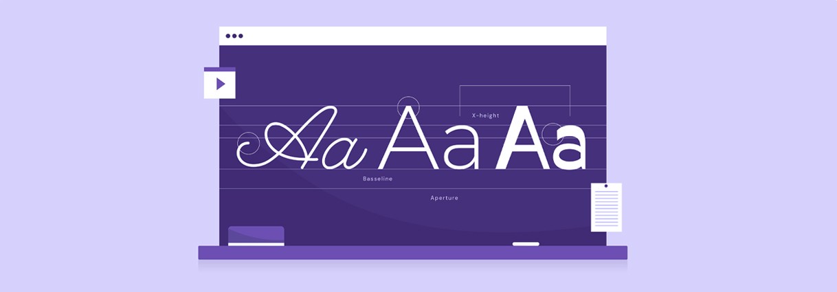
Tips for Mastering Typography in UI UX Design
UIDesignz - UI UX Design Agency
Your UI UX Design Agency For Digital Success
Typography is an essential aspect of any design project, whether it’s a website, a brochure, or a poster. It can impact the readability, accessibility, and overall aesthetics of a design. Good typography can make or break a design, and mastering typography takes practice and knowledge. Designers can create effective and visually appealing typography that enhances the overall?user experience ?of the design. In this post, we’ll discuss 10 tips to help you master typography and create effective designs.
When unsure, stick to one font
When it comes to typography, there are countless fonts to choose from, and it can be tempting to use multiple fonts to create visual interest. However, when unsure about which fonts to use, it’s best to stick to one font. Using multiple fonts can make a design look cluttered and confusing. Instead, focus on other?design elements , such as font size, weight, and color, to create visual interest and hierarchy. Sticking to one font can also make a design look more cohesive and professional. One of the best practices is to stick to one font in your design when unsure. Here’s why:
Left is the new right
In Western culture, we read from left to right. “Left is the new right” is a principle in typography and user interface (UI) design that suggests that left-aligned text is more visually appealing and easier to read than text that is centered or aligned to the right. This means that users will typically read headings from left to right as well. Left-aligned text allows for a more natural reading flow, as readers are accustomed to reading from left to right. It also creates a sense of hierarchy and organization, making it easier for users to scan content and quickly find the information they need. Left-aligned text is also important in?UX/UI design ?for several reasons:
Use any font
There is no right or wrong font to use in?UI design . You can use any font, as long as it is legible and fits your brand and message. However, you should avoid using overly decorative or ornate fonts, as they can be difficult to read and may distract from the content. Fonts are a critical component of typography in UX/UI design. Here are some reasons why:
Contrast
Contrast is a crucial aspect of typography in UI design. It can help your headings stand out and make them easier to read. It refers to the difference in visual properties between two or more elements, such as size, color, weight, and spacing. When used effectively, contrast helps create a hierarchy and visual interest, guide the user’s attention, and improve readability and accessibility. However, be careful not to overdo it, as too much contrast can also make your design look cluttered.
Here are some specific reasons why contrast is important in typography in UI/UX design:
Double isn’t trouble
Using two lines for your headings can help break up long headings and make them easier to read. However, you should make sure that the two lines have a clear hierarchy, with the most important information on the first line.
The first line should always contain the primary message or the main topic of the heading. It should be clear and concise, and provide enough context for the user to understand what the heading is about. This is particularly important because users tend to scan content quickly, so the first line of the heading needs to stand out and catch their attention. By using typographic techniques, you can create a clear and effective hierarchy that improves the overall readability and usability of your design.
Dress for the occasion
Your font choice should reflect the tone and message of your content. For example, if you are designing a website for a law firm, you should choose a font that looks professional and trustworthy. On the other hand, if you are designing a website for a fun and playful brand, you can choose a more whimsical font. When selecting a font for a certain occasion or purpose, there are several important factors to consider:
Grouping
Grouping headings can help users understand the hierarchy of information on your page. You can use font size, weight, and color to group headings, making it clear which headings are most important. Grouping headings in UI/UX design typography is important for several reasons:
Allow your letters to breathe
Spacing between letters can help make your headings more legible and appealing. You can adjust letter spacing (also known as kerning) to create a more balanced and pleasing visual effect. The spacing between the letters, or kerning, is an essential aspect of typography in UI/UX design. Here are some reasons why:
Widows and Orphans
Widows and orphans are single words or lines of text that appear at the beginning or end of a paragraph. They can make your text look awkward and unprofessional. You can avoid widows and orphans by adjusting the line spacing or adjusting the number of words in the line.
No fancy shapes
While it may be tempting to use fancy shapes for your headings, it is best to avoid them. Fancy shapes can be distracting and can take away from the readability of your text. The use of fancy shapes or decorative elements in typography can have a negative impact on UI/UX design in several ways:
Bonus tip
When using headings, make sure to use a consistent hierarchy throughout your design. This will help users understand the importance of different headings and make your design more cohesive.
Conclusion
Typography is a crucial aspect of UI design, and headings play a significant role in conveying information to users. By following these tips, you can create headings that are easy to read, visually appealing, and help enhance the overall user experience. Remember to pay attention to details, such as font size, contrast, and spacing, and use them to your advantage.