PySurv: Plotting Kaplan-Meier Curves in Python
Pushkar Mutha
PhD Student at Georgia Tech - Emory University | AI in Healthcare | Imaging Biomarkers
If you've ever performed survival analysis in Python, you've likely felt the frustration of trying to plot Kaplan-Meier (KM) curves that include all the necessary statistics like hazard ratios, confidence intervals, p-values, risk tables, and more. In the past, I ended up resorting to the inefficient method of exporting my time-to-event data to R or MATLAB to produce the needed plots.
Introducing PySurv
PySurv is a no-nonsense Python package for generating and customizing KM curves with a single line of code. PySurv is inspired from MatSurv and brings similar functionality into the Python environment. It calculates and plots everything in one go: KM curves, hazard ratios with confidence intervals, p-values, median survival times and can show survival percentages at specified time points in the console.
Installation:
Getting started with PySurv is as easy as running the following command:
pip install pysurv
Generating Data and Using PySurv
First, let’s generate some time-to-event data:
import pysurv

# Generate synthetic data for two groups
data = pysurv.generate_time_to_event_data(n_samples=2000, hazard_ratio=0.5, censoring_rate=0.3, seed=42)
This command creates a pandas DataFrame with time, event, and group columns.
Minimalistic Usage
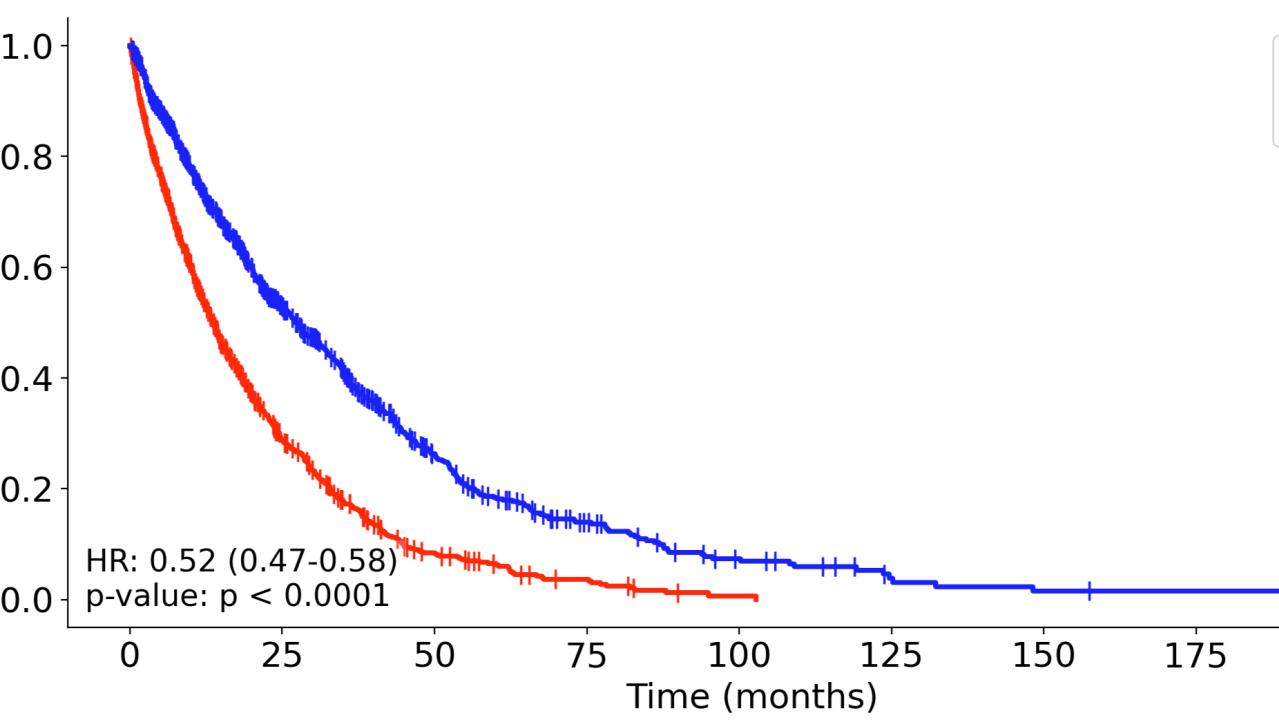
To plot a KM curve with PySurv, you need only the DataFrame and the names of the columns that hold your time, event, and group data:
领英推荐
# Plot the KM curve and display statistics
pysurv.plot_km_curve(data, time_col='time', event_col='event', group_col='group')
This generates the following KM curve and displays relevant statistics in the plot as well as the console, such as the hazard ratio and median survival times.
Customizing KM Curves
PySurv accepts a variety of parameters that let you tailor nearly every aspect of your KM curve in one go. You can get creative and modify group labels, title, axes labels, colors, font size, line styles and widths, save the plot, and more by passing additional arguments to the plot_km_curve function.
Here's an extended example
pysurv.plot_km_curve(
    data,
    time_col='time',
    event_col='event',
    group_col='group',
    group_labels=('Control', 'Treatment'),
    title="Kaplan-Meier Plot",
    y_label="Survival Probability (%)",
    x_label="Time (days)",
    colors=['orange', 'blue'],
    show_ci=True,
    survival_time_points=[12, 24],)
And here's the output
For more information, visit PySurv's documentation. If you find this package useful, please consider supporting it by leaving a star on GitHub.
PhD Student at Emory | Medical AI
2 个月Lovely! Worked very well with my data. Thanks!
SEO | CONTENT CREATION | SOCIAL MEDIA MARKETING| WEBSITE DESIGNING|
2 个月Excellent work Pushkar
Chief Neurosurgeon | Author | Clinical Researcher | Mentor | Learner | Patient Safety Advocate | CoFounder - Ushakiran Foundation
2 个月Very useful!Thanks for this contribution
Data Scientist | CVS Health, Ex-NVIDIA (RAPIDS-GPU) | NLP & ML Expert | Databricks Certified.
2 个月Smooth!
IIT Madras 25'
2 个月Looks great