Mastering Responsive Power Apps Form Design: A Beginner's Guide
Abhishek Dhoriya
Sr Consultant COE @ Microsoft | AI | Azure | Power Platform | Solution Design & Delivery Lead | ScrumMaster
In today's fast-paced digital world, the ability to create responsive forms that look great and function seamlessly across various devices is crucial. Enter Microsoft Power Apps—a powerful, intuitive platform that allows you to design responsive applications and forms without needing to be a coding wizard. For those who are new to this, responsive Power Apps form design can seem daunting, but don’t worry! We’ll break it down for you in the simplest terms.
What is Power Apps?
Before diving into responsive design, let’s clarify what Power Apps is. Power Apps is a suite of applications, connectors, and a data platform including services like Power BI, Power Automate, and Power Virtual Agents. It offers you the tools to quickly create custom business applications that connect to your data stored either in the underlying data platform (Common Data Service aka. Microsoft Dataverse) or across various online and on-premises data sources.
What is Responsive Design?
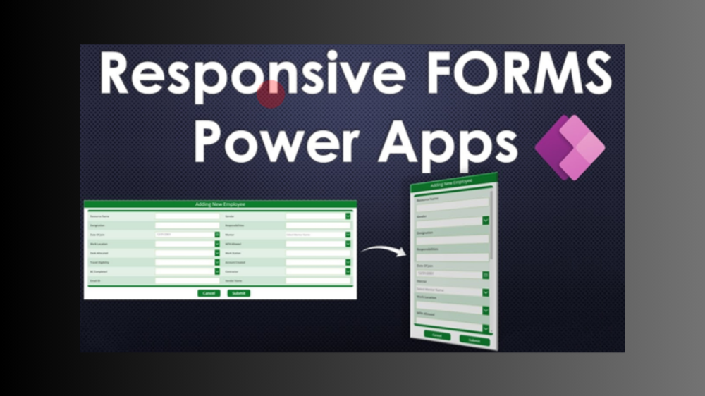
Responsive design refers to designing apps that automatically adjust their layout to look great on any screen size, from large desktop monitors to small mobile devices. This ensures a clean and user-friendly experience regardless of the device in use.
Why Go Responsive?
Getting Started with Responsive Power Apps Form Design
Step 1: Setting Up Your Environment
Step 2: Understand Your Layout Options
Power Apps offers two primary layout components—Screen Size + Orientation and Containers.
Step 3: Utilizing the Snap-to-Grid Feature
Enable the snap-to-grid feature to help align your controls accurately within containers. This ensures a more polished and professional layout.
Step 4: Apply Flexible Height & Width
Set controls to “AutoHeight” and “AutoWidth” where applicable. This dynamically adjusts control sizes based on the content, ensuring a fluid form layout.
Step 5: Using Formulas for Dynamism
Understand and use Power Apps formulas to make your forms more dynamic.
领英推荐
Width = Parent.Width * 0.8
Best Practices for Responsive Design in Power Apps
Mobile-Friendly Form Tips
Conclusion
Creating responsive forms using Power Apps doesn’t have to be a challenging task. With an understanding of responsive design principles and the functionalities within Power Apps, you can design applications that offer excellent user experiences across different devices. Remember to keep testing and tweaking your layouts to ensure they work as envisioned.
FAQs
How do you make a form responsive in Power Apps?
To make a form responsive, use containers for layout management, apply flexible height and width, and implement formulas to dynamically adjust elements based on screen size.
What are the best practices for responsive design in Power Apps?
Consistent spacing, grouping elements, thorough testing, and starting with a minimum viable design are key best practices for responsive design.
Can I create mobile-friendly forms in Power Apps?
Absolutely! Use larger buttons, ensure readability with appropriate fonts and colors, and optimize media for faster loading times.
How do I optimize a form for different screen sizes in Power Apps?
Utilize responsive formulas for width and height properties, group elements cohesively, and leverage the power of containers to manage layouts effectively.
What tools can help in designing responsive forms in Power Apps?
Use the snap-to-grid feature, screen size + orientation settings, and built-in containers to facilitate the design of responsive forms in Power Apps.
Summary
Responsive Power Apps form design is essential in today’s multi-device world. By leveraging layout components, dynamic formulas, and best practices, you can create user-friendly forms that look and function beautifully across all screens.