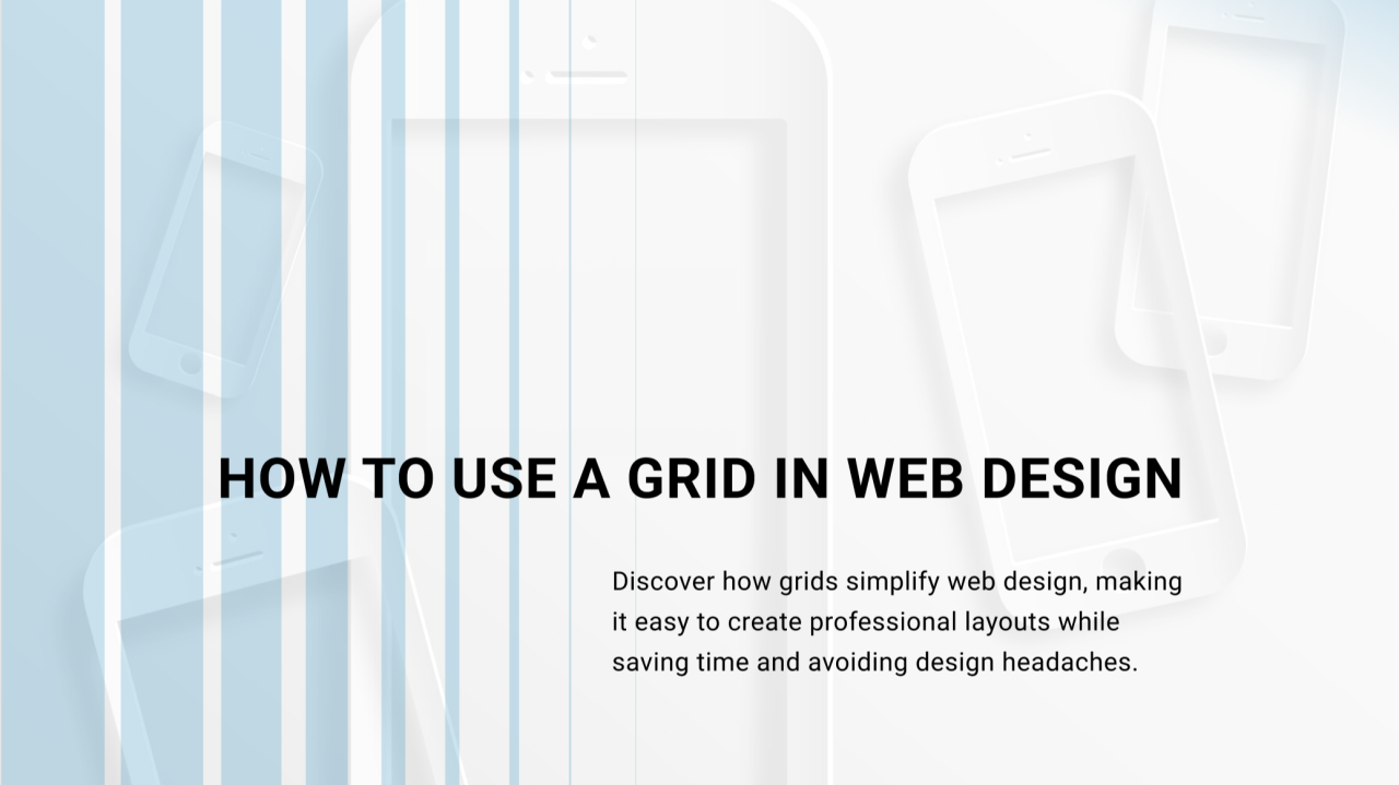
Mastering Grid Systems in Web Design
Artemii Tkachuk
CEO at IvorySoft | Software development company | Tech Partner for Startups | Stand for Ukraine ????
Read the full article on our website: link
Grid systems are essential for creating structured, balanced, and visually appealing web layouts. They help designers maintain consistency and improve user experience while making the development process more efficient.
Why Use a Grid?
Grids bring order to your design, ensuring proper alignment, spacing, and readability. They make layouts scalable and responsive across different devices.
Types of Grids:
??Manuscript Grid – A simple, single-column layout often used in blogs and articles.
??Column Grid – The most common type, dividing the page into multiple columns for flexibility.
??Modular Grid – Uses both columns and rows for more structured designs, often seen in dashboards.
??Hierarchical Grid – A freeform approach used when unique visual hierarchy is needed.
Best Practices for Using Grids:
??Maintain equal spacing and alignment for a clean look.
??Choose a grid type based on your project needs.
??Use responsive grids to adapt designs across screen sizes.
??Avoid overcomplicating layouts—simplicity enhances usability.
Grids are a game-changer in web design, but there’s much more to explore! Read the full article on our website!