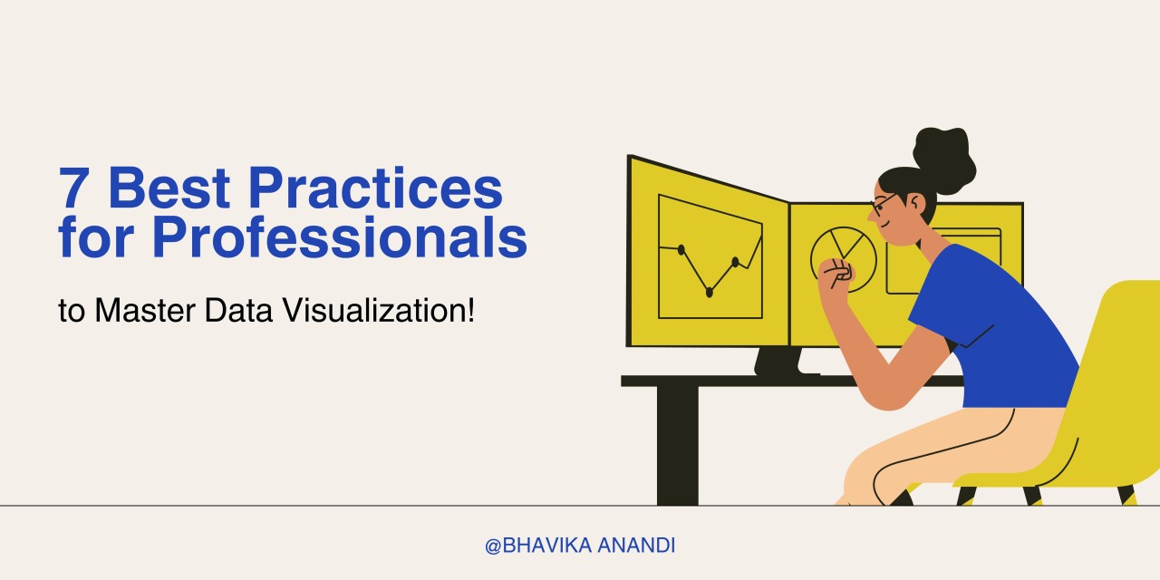
Mastering Data Visualization: 7 Best Practices for Professionals
Data visualization is more than just creating charts - it's about transforming raw data into compelling insights that drive decisions. With over a decade of experience, I've seen firsthand how the right visualizations can change the trajectory of a project. Here’s what I’ve learned and how you can apply it to your own work.
Knowing Your Audience
Understanding who will see your visualizations is the foundation of effective design. Whether you're presenting to technical teams, executives, or the public, it's crucial to tailor your visuals to their needs. For example, when presenting complex data to non-technical stakeholders, simplifying the visuals and focusing on key insights makes the information far more digestible and impactful. It’s amazing how much more productive meetings become when everyone is on the same page.
Picking the Right Chart Type
The type of chart you choose can make or break your presentation:
I’ve often found that selecting the right chart type is what separates a clear message from a confusing one. In one of my projects, using line charts to show YoY revenue trends over time of a customer sample set, made the insights crystal clear to the stakeholders, leading to swift decision-making.
Simplifying Complex Data
Complex datasets can easily overwhelm an audience. The challenge is to distill this complexity into visuals that are easy to understand. I’ve tackled projects with large datasets where breaking down the data into more manageable pieces and focusing on the most relevant metrics made all the difference in helping stakeholders make informed decisions.
The Impact of Color
Color is a powerful element in data visualization, but it needs to be used wisely. Effective use of color can highlight the most important data points, while poor choices can create confusion. I’ve seen how a consistent color scheme can significantly improve the clarity of visualizations, making them not just more appealing, but also more effective.
领英推荐
Adding Context
Every good visualization needs context - without it, even the best charts can be misunderstood. Labels, legends, and annotations are your best friends here. In one dashboard I worked on, adding annotations to key data points provided clarity and helped the audience quickly grasp the main insights. This simple addition made the data come to life.
Embracing Interactivity
Interactive visualizations are a game-changer. They allow users to explore the data themselves, leading to deeper insights. Tools like Power BI and Tableau enable you to create dashboards that let users filter and drill down into the data. I’ve seen how interactive dashboards can empower clients to make more informed decisions, by letting them slice the data exactly how they need.
The Importance of Feedback
No visualization is perfect on the first try. Iterative testing and gathering feedback are crucial. I’ve worked on projects where multiple rounds of feedback led to significant improvements in the final product, making it far more effective and user-friendly.
Insights Gained from Experience
Data visualization is both an art and a science, and mastering it takes practice. Staying current with industry trends, learning from mistakes, collaborating with stakeholders, and constantly experimenting with new tools and techniques are key to developing this skill.
The best practices I have mentioned above, combined with your personal experience, can help you craft visualizations that don’t just inform - but ones that inspire action!
What are your thoughts on these practices? How do you approach data visualization in your work? Let’s continue the conversation - I’d love to hear your insights!
Senior Engineer / BI Architect at Rolls-Royce Solutions Asia | Engineering for Service (MRO, Maintenance Schedule, BI Dashboards) | Passionate Marathon Runner | Completed 5 World Major Marathons
6 个月Good one