Cracking the Code: Mastering Data Visualization for Scientific Publications
Buble Studios
Full-service creative & animation studio?? Crafting stellar visuals for space businesses.
In the realm of scientific publishing, the role of data visualization can't be overstated. As the popular adage goes, "A picture is worth a thousand words," and in scientific research, it might be worth even more. Visualization translates dense, complex data into digestible, comprehensible content. But mastering this art can feel like cracking a cryptographic code; it demands a unique blend of analytical acumen, design proficiency, and storytelling prowess. This article explores how to select the right visualizations, ensure clarity and accuracy, enhance visual appeal, effectively integrate visualizations in research papers, tell a compelling story, and address potential challenges in the process.
1. Choosing the Right Visualizations
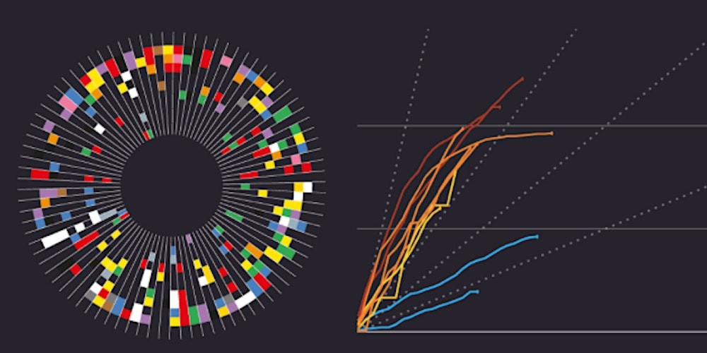
Visualizing data is like choosing the right lens for a camera. The wrong choice could blur your data's true nature, while the right one brings everything into focus. Choosing appropriate visualizations depends on the nature of the data you're handling. If you're dealing with trends over time, line graphs could be your perfect match. If you're exploring relationships between variables, scatter plots might be your ally. Maps can visualize geographical patterns, while bar charts can compare different groups. Highlighting key relationships, trends, and patterns through visuals allows the essence of the data to emerge and paves the way for significant insights.
Data Visualization Resources
2. Ensuring Clarity and Accuracy
In the realm of data visualization, two guiding principles reign supreme: clarity and accuracy. A powerful visualization is an amalgamation of simplicity and precision, with each element contributing to a comprehensive understanding of the data.
Consider the elements of a graph, for instance. Labeling these—axes, units, data series—may seem rudimentary, yet their absence or confusion can render a graph indecipherable. Clear labels illuminate the path for viewers, eliminating the need for guesswork and fostering precise interpretation. In this sense, labels serve as the visualization's road signs, directing the viewer's journey through the data.
Ambiguity is a pitfall to be scrupulously avoided. Overlapping data points can convolute meaning and distort perceived relationships. Similarly, inconsistent scales can skew perspectives and misrepresent comparisons. Striving for a visualization that exudes clarity and consistency is crucial to maintain the integrity of the data story.
Context is the final brushstroke that completes the data picture. It's the backdrop against which data points take their rightful place. Whether it's a historical reference that shows the evolution of data over time or a mention of a control group that highlights the significance of the research, context imbues data points with depth and relevance. It enriches the visualization, weaving a comprehensive narrative that encompasses not just the 'what' and 'how', but also the 'why' and 'so what' of the data.
3. Enhancing Visual Appeal
In the arena of data visualization, accuracy alone doesn't cut it. The true magic unfolds when accuracy weds aesthetics, sparking an engaging and enlightening dialogue with the audience. A visually appealing color palette does more than just please the eye; it plays a pivotal role in fostering understanding. By differentiating data sets and spotlighting key insights, it transcends the realm of decoration and becomes an integral aspect of comprehension.
Similarly, font choices speak volumes. They ought to be legible, even at petite sizes, ensuring every word or number assists rather than impedes understanding. A font, thus, isn't merely a stylistic choice; it's a conduit for data interpretation.
The concept of visual hierarchy transforms the way we present and perceive data. By emphasizing certain elements over others, we can guide the reader's gaze and underline crucial points. This strategic arrangement and presentation of elements become a navigational tool, gently steering the reader through the data terrain.
In summary, effective visualizations aren't just attractive; they're thoughtfully designed cognitive maps that enhance comprehension and memory retention. They are not just aesthetic, but also deeply analytical, striking a balance between form and function.
To delve deeper into these concepts, the following resources are recommended:
4. Integrating Visualizations in Research Papers
Visualizations aren't simply standalone entities; they form an integral part of the narrative and as such, their integration within the text demands thoughtful consideration. Their placement is not arbitrary; it's strategic, providing a visual anchor for the intricate concepts discussed. This adjacency to relevant text infuses them with context and bolster comprehension, effectively translating abstract ideas into tangible visuals.
领英推荐
Referencing visualizations within the text isn't merely a cosmetic enhancement; it's a cognitive guidepost that reinforces the salience of key points. It's akin to a tour guide pointing out landmarks on a journey - ensuring that the readers not only appreciate the views but also comprehend their significance within the broader landscape.
Captions are the proverbial cherry on the cake, but their role extends far beyond an ornamental add-on. They serve as interpreters, decoding the visualization and distilling its essence in a succinct format. By delineating the purpose and conclusions drawn from each visualization, captions bridge the understanding chasm, providing a panoramic view of the research and its implications.
At their best, well-integrated visualizations in scientific publications serve as windows into the heart of research, offering readers a synthesized view of complex data and fostering a deeper engagement with the material. Thus, thoughtful placement, diligent referencing, and articulate captions transform visualizations from mere illustrations to illuminating revelations.
5. Telling a Story with Visualizations
Data visualizations serve as the compass and chronicle of your research journey, guiding readers from the inception of your hypothesis through to the conclusion. Yet to effectively narrate this journey requires skill, strategy, and thoughtful design.
Firstly, consider the structure of your narrative. Just as a story typically unfolds from introduction to climax to resolution, your data story should follow a logical sequence. Begin by introducing the research question or hypothesis. What problem does your research aim to solve? Next, present the methodology and the data collected, and then move on to discussing the analysis and key findings. Finally, conclude with the implications of your research. This narrative arc provides a logical and coherent progression through your research, and arranging your visualizations in line with this arc can greatly enhance the reader's understanding.
Sequential visualizations can be instrumental in demonstrating the progression of findings. By arranging your visualizations to mirror the sequence of your research stages, you create a rhythm and flow to the data story, guiding your audience from one stage to the next.
The power of storytelling extends to the smallest details. Visual elements such as arrows, pathways, and connectors serve as guideposts, leading your audience through your research landscape. These elements can highlight the connections and relationships between data points, making the underlying narrative more digestible and engaging.
Here are a few resources that can guide you further in leveraging data visualization for storytelling:
6. Addressing Challenges and Considerations
Finally, like any discipline, data visualization has its set of challenges and considerations. Missing or incomplete data, for example, can distort a visualization and misrepresent the findings. Adapting visualizations to different publication formats and platforms demands flexibility and creativity. Moreover, we must ensure accessibility and inclusivity by providing alternative formats, like data tables or descriptive text, to accommodate all potential readers, including those with visual impairments or color blindness.
Addressing these issues involves a mix of careful data handling, understanding of the publishing context, and empathy for the diverse audience.
Missing or incomplete data should be managed with caution, possibly using statistical techniques to estimate missing values, or transparently excluding them while indicating their absence in the visualization.
As the digital landscape continues to evolve, our visualizations must adapt too. This might involve creating responsive designs that resize for different screen dimensions or even creating interactive visualizations for online publications.
Ensuring accessibility is a non-negotiable aspect of responsible data visualization. Using patterns or textures in addition to color can assist those with color blindness, while alternative text descriptions and data tables can aid visually impaired readers.
Conclusion
Decoding the art of data visualization for scientific publications is a challenging yet rewarding journey. By choosing the right visualizations, maintaining clarity and accuracy, enhancing visual appeal, integrating visualizations seamlessly into the body of research papers, narrating compelling data stories, and overcoming the associated challenges, we can turn our data into a vivid tapestry of insights. It's about transforming data from abstract numbers into a universally readable language.
In essence, data visualization is not merely a reporting tool, but a scientific storytelling medium. When we crack this code, we unlock the power of data, rendering it accessible, engaging, and enlightening for all.