Auto Layout in Figma: A Comprehensive Guide to Building Responsive Designs
Figma has become one of the leading design tools used by UI/UX designers worldwide, offering an array of powerful features for collaborative design work. One of the standout features of Figma is Auto Layout, a versatile tool that empowers designers to build flexible, adaptive, and responsive layouts quickly and with precision. In this guide, we will dive deep into Auto Layout, explore its features, understand how to implement it in various design scenarios, and discuss the many advantages it brings to the design process.
Table of Contents
1. What is Auto Layout?
Auto Layout is a Figma feature that allows designers to create fluid layouts that automatically adjust based on their content. Whether you’re designing buttons, cards, or entire screen layouts, Auto Layout ensures that the design elements automatically resize or reposition themselves depending on their content or container’s dimensions. This can significantly streamline the design process, especially when working on projects that require frequent changes or updates to content.
In simpler terms, Auto Layout is a way of telling Figma to "take care of the layout" for you, adjusting the spacing, alignment, and sizing of elements without you having to manually tweak each one. It’s a key tool for building responsive UI elements that maintain consistency regardless of screen size or content changes.
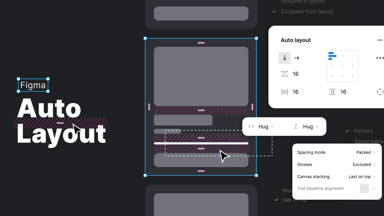
2. Understanding Auto Layout Properties
To fully understand how Auto Layout works, it’s essential to break down its key components and properties. These properties allow you to control how elements inside a frame behave when the frame’s size or the content of the elements changes.
Direction
One of the primary controls in Auto Layout is the direction of the layout. It defines whether the items inside a frame will be arranged horizontally or vertically. You can choose between:
Spacing
Spacing defines the amount of space between each element within the Auto Layout frame. This can be set globally for all elements inside a frame or individually between specific elements. Spacing is crucial for maintaining consistent margins and paddings throughout the design.
Alignment
Alignment controls how the elements are positioned within the frame. You can align items:
This feature ensures that your UI elements are always aligned in a clean and organized manner.
Resizing Behavior
Auto Layout provides different options for resizing elements inside a frame. The resizing options include:
Nesting Auto Layout Frames
Auto Layout frames can be nested within other Auto Layout frames, allowing you to create more complex layouts. This feature provides flexibility and control over how elements are structured. Nested frames enable designers to build intricate designs while ensuring that each section adapts automatically to changes in content.
3. How to Use Auto Layout in Figma
Now that we have a fundamental understanding of what Auto Layout is and its properties, let’s dive into how to use it in Figma to build responsive designs.
Step 1: Create a Frame
Start by creating a new frame using the Frame Tool (shortcut F). Frames are essential in Figma as they act as containers for UI elements. You can also select an existing frame and apply Auto Layout to it.
Step 2: Apply Auto Layout
With your frame selected, open the Properties Panel on the right side of the screen. Look for the Auto Layout section, and click the “+” button to enable Auto Layout for the selected frame. Once applied, the frame will automatically adjust its contents based on the settings you configure.
Step 3: Configure Auto Layout Settings
After enabling Auto Layout, several new options will appear. These options will allow you to control how the frame behaves. Here are some of the settings you can adjust:
Step 4: Add and Adjust Elements
After configuring the layout, start adding UI elements such as text, images, buttons, or icons. As you add or adjust these elements, the Auto Layout frame will dynamically adjust its size, position, and spacing based on the content inside.
Step 5: Nest Auto Layout Frames
For more complex designs, you can nest Auto Layout frames inside other Auto Layout frames. This allows you to create flexible layouts with multiple nested elements. For example, you can have a main container with horizontal items and a nested vertical container within it.
4. Advanced Auto Layout Techniques
Once you’ve mastered the basics, you can start exploring advanced Auto Layout features. Here are some techniques to take your design workflow to the next level:
Responsive Design with Constraints
When creating responsive designs, Auto Layout works hand-in-hand with constraints. Constraints allow you to specify how elements should resize relative to their parent container. You can control the behavior of each element by setting constraints for both width and height, which is useful for creating designs that look great on various screen sizes.
Using Variants with Auto Layout
Figma allows you to create Variants for components, and combining this with Auto Layout lets you create dynamic, responsive component systems. Variants help you design components with multiple states (such as different button sizes, colors, or states) that automatically adjust to the content or the context in which they are used.
Auto Layout with Nested Components
By nesting Auto Layout frames within components, you can create reusable design elements that adapt based on the content provided. For example, a navigation bar with Auto Layout will automatically adjust the size of the menu items as the content changes.
Interactive Components
Auto Layout also works well with Figma's interactive components. You can use Auto Layout with component variants to create buttons that change their layout based on user interaction or screen size.
5. Best Practices and Tips for Auto Layout
While Auto Layout is a powerful tool, there are several best practices you should follow to make the most of it:
6. Benefits of Using Auto Layout in Figma
Using Auto Layout brings numerous benefits to your design process:
7. Common Challenges and How to Overcome Them
While Auto Layout is incredibly useful, there are some challenges designers may face when using it:
8. Conclusion
Auto Layout in Figma is a game-changer for designers seeking to create flexible, scalable, and responsive designs. By automating layout adjustments based on content and screen size, Auto Layout enhances efficiency, consistency, and collaboration among teams. By learning and mastering Auto Layout, designers can significantly streamline their workflow, create dynamic and adaptive UI elements, and ensure a consistent user experience across various devices and platforms. As you explore more advanced features like constraints, variants, and interactive components, you’ll find that Auto Layout will become an indispensable tool in your design toolkit.